An expert guide to everything you need to know about U-shaped kitchens, with design ideas, tips and inspiration for creating a stylish kitchen built for your life.
What is a U-Shaped kitchen?
In a classic U-shaped kitchen, the cupboards, worktops and appliances are arranged along three adjoining walls of the room in a ‘U’ or horseshoe shape, leaving an open area in the middle. One wall acts as the U’s ‘base’ (often but not always featuring the cooker and/or sink) while the other two act as its sides and typically feature storage and work surfaces.
U-shaped kitchens are normally associated with larger kitchen spaces so will often include an island in the central area.
The U-shape is an alternative to the other most common layout, the L-shaped kitchen, where the cabinets and appliances are arranged along just two walls, making for a more open-plan space.
If it’s designed well, a U-shaped layout is practical and efficient with plenty of storage and surface space, and enabling a good flow of movement around the kitchen when you’re working.
How much space do you need for a U-shaped kitchen?
For a classic U-shaped kitchen you’d normally want at least 100 square feet, but the layout can also be used in smaller spaces, or fitted into areas within large and unusually-shaped rooms.
Our design team will be able to look at your available space and advise on whether a U-shape will work for you. you're ready to talk about your new kitchen, book an appointment by clicking here!
What are the advantages of a U-shaped kitchen?
Kitchens are where real life happens: they’re multifunctional spaces used for everything from cooking and eating to hosting, homework and crafts. So when planning your kitchen layout, you need to think about how you and your family will use it.
The advantages of a U-shaped kitchen include:
- Generous storage – the three-sided layout of a U-shaped kitchen means you can include plenty of base cabinets, wall units and drawers, giving you maximum capacity for storing dishes, cookware and so on while keeping clutter to a minimum.
- Ergonomic layout – the arrangement of the kitchen around three sides can create a space that’s really practical and accessible for cooking, with everything within easy reach and a good flow between the main working areas.
- Lots of worktop space – a U-shaped design offers three runs of worktops, so if you also have an island, that’s acres of space for prepping food.
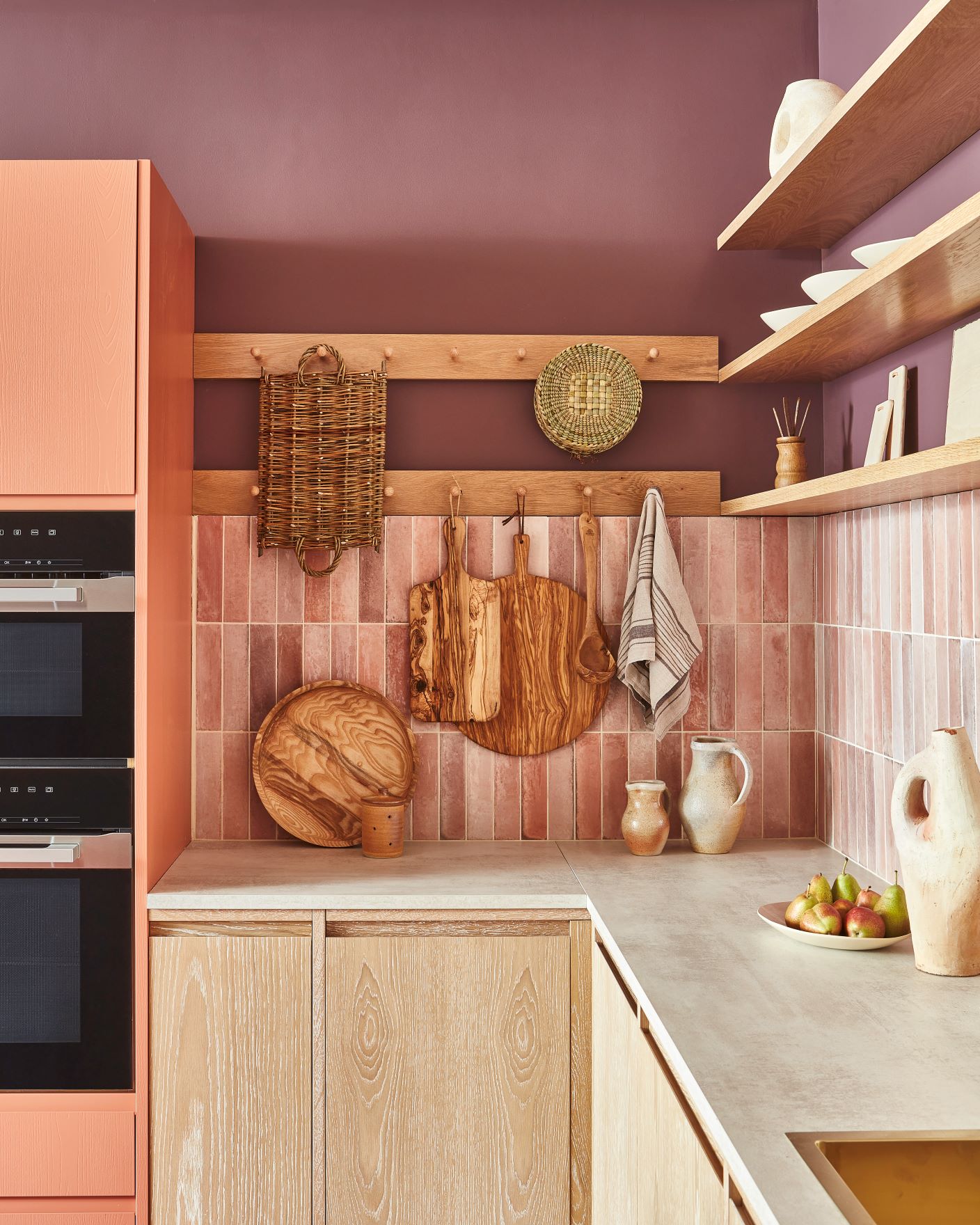
- Scope for decorative design features – Having three walls available to you might mean you opt to include more decorative features in addition to wall cabinets, such as a tiled splashback.
Planning a U-shaped kitchen - tips and ideas
Here are some ideas for planning your U-shaped kitchen...
1. Think about the 'kitchen work triangle'
The kitchen work triangle (or ‘golden triangle’) is a design concept that aims to make the kitchen a more efficient and ergonomic place. The idea is that the three main working areas of the kitchen – the cooker, sink and refrigerator – should form an imaginary triangle, with each element being close (but not too close!) to the others, ensuring that everything is within easy reach and minimising the amount of time and energy you spend moving between them.
A U-shape lends itself to a very ergonomic layout, where everything you need to access regularly is within easy reach. So when designing your kitchen, think about exactly what and how you use it on a day-to-day basis, and that will help you to plan which features will form the base and sides of the U shape.
Find out more about the kitchen work triangle here: kitchen work triangle - an expert guide
2. Centre a U-shaped kitchen around a window

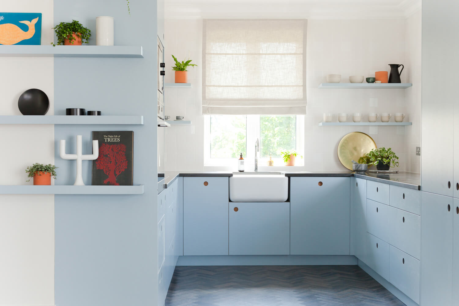
Many U-shaped kitchens centre the design around a focal point such as a window, with the sink situated underneath in the middle run of the U-shape, and the cooker and fridge positioned on the other two opposing sides. This arrangement allows for plenty of natural light (and a good view when you’re washing up!)
Kew Penthouse kitchen (above) really makes the most of the available kitchen space, featuring cabinets and worktops on three sides, together with an integral oven and a butler sink placed centrally under the window, which provides an inviting focal point. The light blue and white colour scheme makes the space feel light and airy, while the painted shelving and flooring extend the kitchen area into the wider space, creating a good visual flow.
3. Incorporate seating with a peninsula
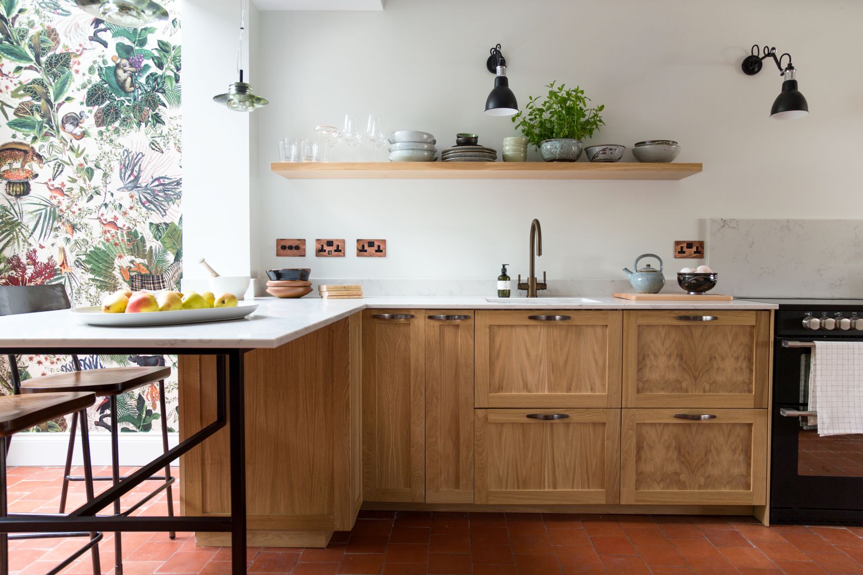
You can incorporate a breakfast bar into a U-shaped kitchen by extending the worktop on one side of the U-shape, or by swapping a set of base cupboards for a set of folding stools.
Meanwhile, a peninsula can extend the kitchen space out towards the centre of the room without the need to use a third wall. This can be a good way of creating a distinction between the kitchen and living/dining area in an open-plan space, while still maintaining a visual link between the two.
4. Use an island as a 'fourth wall'
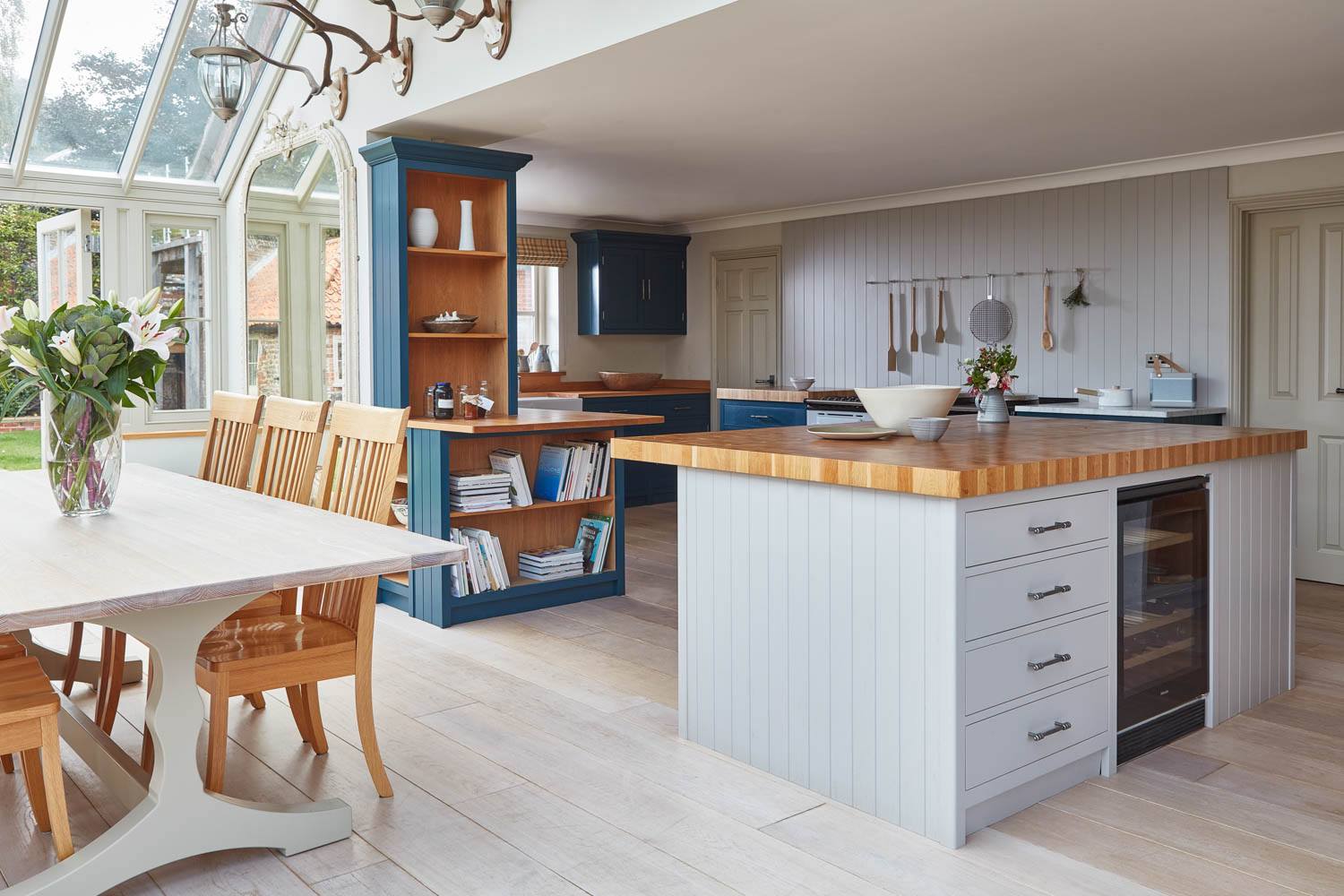
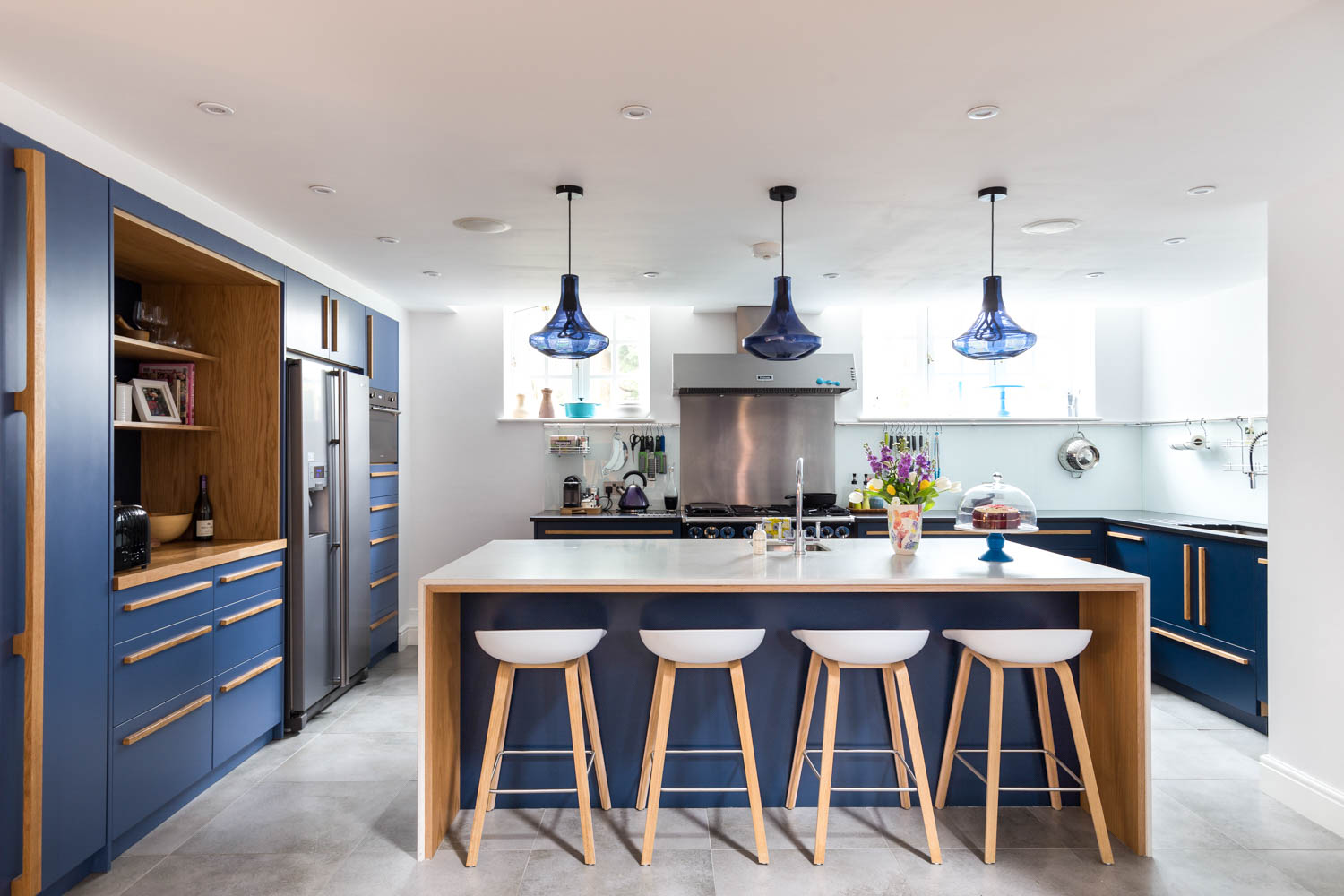
If you’re lucky enough to have a very large kitchen-diner space, you can really make the most of it by installing a U-shaped kitchen in one area, and then using an island as the fourth wall of a ‘square’ (set a little way off so there’s plenty of room to walk around it).
The Cley kitchen (above) does this brilliantly, making for a stunning living space as well as a very practical kitchen.
5. Use open shelving to create a sense of space

A U-shaped layout is great for maximising the available storage space in a small kitchen, but in a narrow kitchen three full rows of cabinets could result in the space feeling a little cramped.
You can help to break up a wall of cabinets and open up the space, by featuring some open storage along one side of the kitchen. Open shelving is also great for displaying things like potted plants and herbs, cookbooks and crockery collections, adding pops of colour and visual interest.
6. Use smart storage in corner spaces
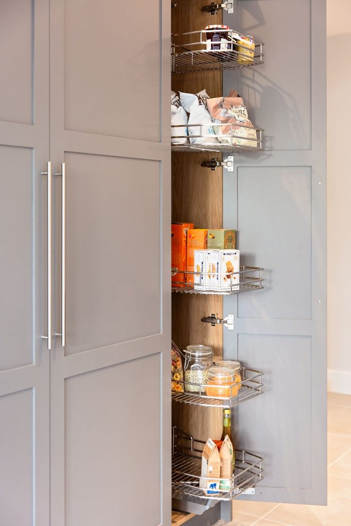
One of the challenges of a U-shaped kitchen layout is that it creates two large enclosed corner areas as part of the floorplan. But you can turn this into a feature rather than a bug by including some clever pull-out storage. A carousel or articulated corner caddy can really maximise the storage potential and make an otherwise tricky area a useful everyday space.
Find out more about kitchen storage options here: Clever bespoke kitchen storage solutions - 11 ingenious ideas to inspire you
7. Make a style statement with bold colours and patterns
.jpg)
Even in a small U-shaped kitchen you can still make a grand style statement. Darker colours such as deep blues or greys can create a sense of depth and even drama. Take the petite but perfectly-formed U-shaped kitchen above: frameless Ladbroke door fronts in rich Brancaster Blue paired with exposed timber worktops, geometric tiling, contemporary pendant lights…it may be small, but it’s a stunner!
At Naked Kitchens we can help build the perfect kitchen for your life. Find out how to get started here.
Frequently Asked Questions
Does a U-shaped kitchen layout work in a smaller space?
Absolutely, if done well. A U-shaped kitchen can make the most of the available space, offering plenty of storage and worktop space, while the three-sided layout allows for a good flow of movement. You can make a small U-shaped kitchen feel less enclosed by including some open shelving or glass fronted units and opting for sleek cabinetry with integrated handles, for a streamlined feel.
Is a U-shaped kitchen suitable for open-plan layouts?
Yes – a U-shaped kitchen layout works very well in an open-plan space, and including a peninsula or kitchen island can help to delineate the kitchen area, while still linking it to the wider space.
See also
The kitchen work triangle - an expert guide
Kitchen ergonomics: 5 clever ways to make your kitchen design more efficient
Clever bespoke kitchen storage solutions - 11 ingenious ideas to inspire you
Small but beautiful: A complete guide to designing and maximising the space in a small kitchen


